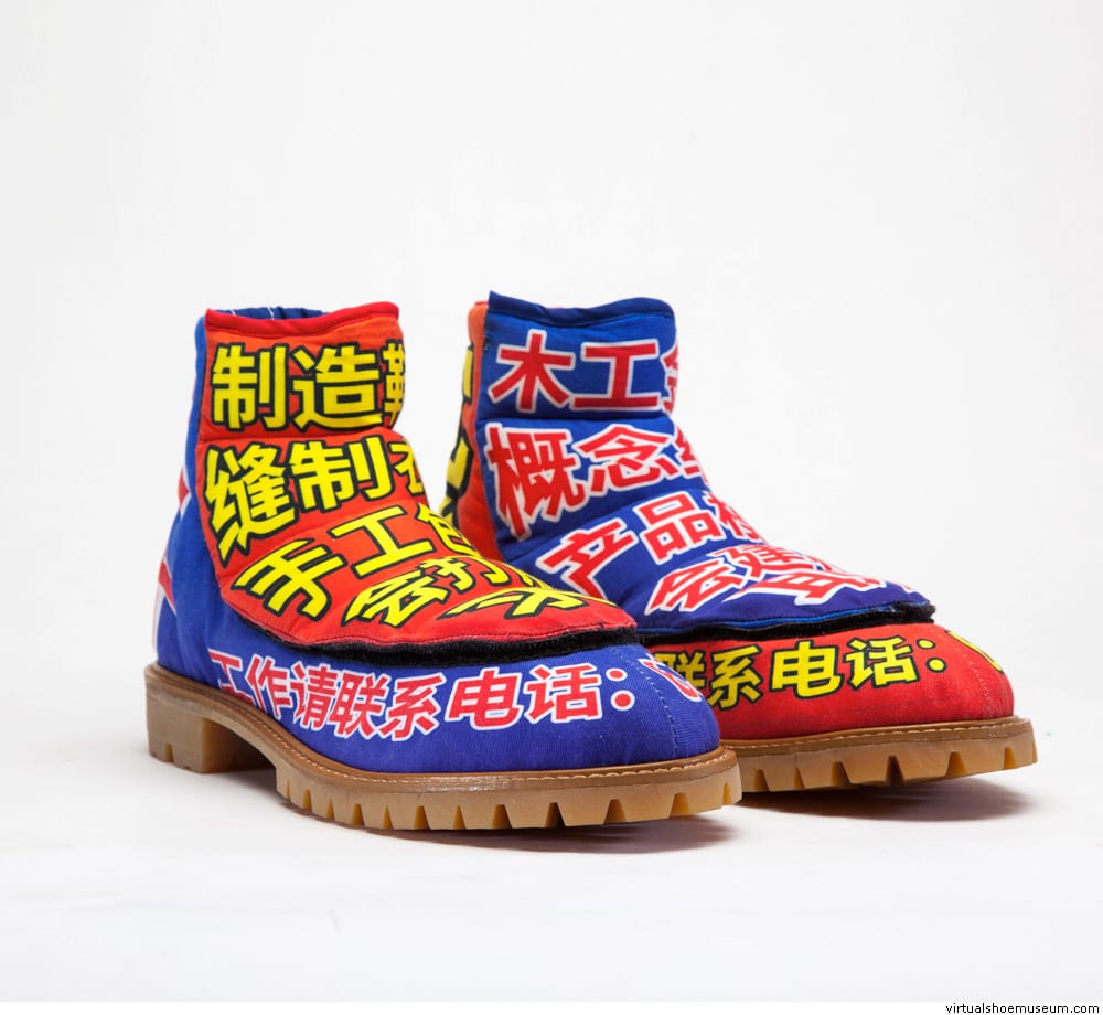
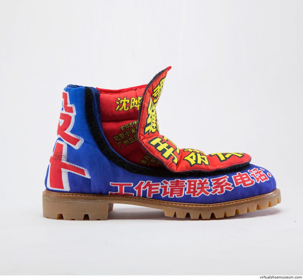
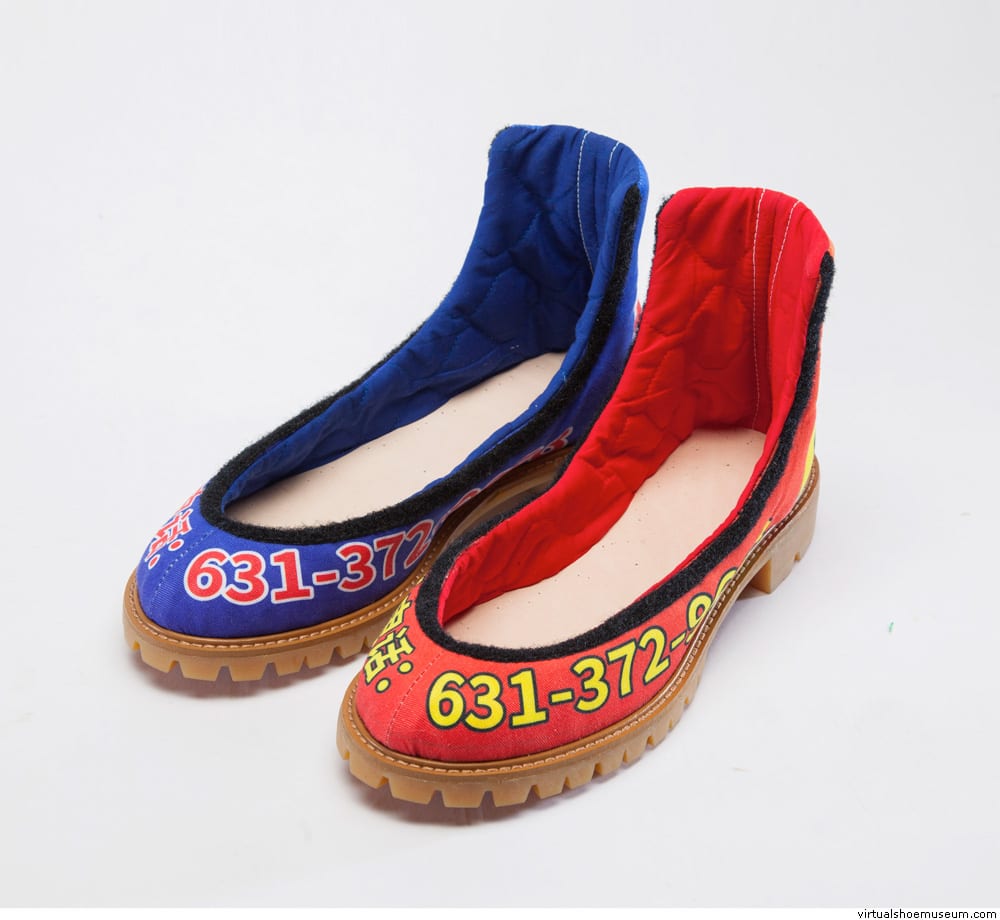
This is an investigation of Chinese store signs, 2019.
“Why are store signs in China so damn ugly?’ is the starting point of this project.I conducted researches onto this matter. Reasons can be concluded as below:
1. Not worth it–short lifespan of shops and restaurants
2. Can’t afford it–bad economic environment for individual shop owners.
3. Don’t know about it–lack of knowledge about design.
That’s why no effort and money is spent by shop owners to create their shop signs, leading to the situation that the aesthetic is no longer valued. Instead, signs needs to be as eye catching as possible, which results in these hideous visuals with max saturation and zero balance in every element, constantly destroying people’s optical nerves. Chinese elements are popular design elements nowadays either in fashion or furniture or architecture, etc. However, artists and designers always pick from the beautiful side of Chinese elements: the culture, the history, etc. However, the less aesthetically pleasing elements are never touched. these shop signs are rooted in the most fundamental class of living environment in China; they are what I grew up seeing everyday, yet nobody explores them as they are obnoxious as hell. So I decided I will, I will dig into the dark side of Chinese Graphic Design and employ this obnoxious language onto my own work, loud and proud. No matter what, the goal of these signs are to advertise the store, so, the goal of my project is to advertise myself, as I am a graduating senior that is looking for a job. I will design my resume in such language, and make them into garments, shoes and accessory pieces. I will print my resume, business cards, contact onto fabric with the language of Chinese store signs. I will wear these functional garments to interviews and job events to advertise myself and communicate to recruiters with them.


